Is your website Mobile friendly? If not, it’s like having a storefront with the doors locked during peak shopping hours. You’re missing out on a massive chunk of potential customers glued to their smartphones. But fear not! This blog, Why Your Website Needs to Be Mobile-Friendly: A Guide to Mobile Optimization, is unlocking the magic of mobile optimization and welcoming a flood of happy visitors.
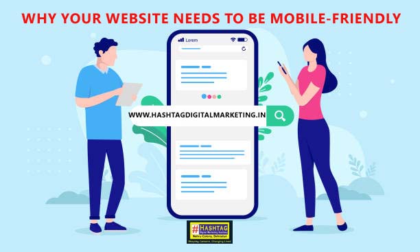
What is Mobile Optimization:
Mobile optimization isn’t just shrinking your website to fit a phone screen. It’s about giving your visitors on the go a superstar experience. Think lightning-fast loading speeds, fingertip-friendly buttons, and content formatted perfectly for those smaller screens. Basically, it’s about making sure your website looks and works flawlessly, no matter what device your visitors use.
Why Your Website Needs to Be Mobile-Friendly:
Mobile optimization goes beyond simply ensuring your website displays on a mobile screen. Here’s why it’s essential:

- Enhanced User Experience (UX): A mobile-optimized website boasts lightning-fast loading times, effortless navigation with large buttons, and content formatted for smaller screens. This translates to a frustration-free experience for visitors on the go, keeping them engaged and more likely to return.
- Boost Your Traffic and Engagement: With mobile dominating web traffic, a mobile-friendly website is a magnet for visitors. A positive UX keeps them on your site longer, leading to increased engagement and conversions, be it a sale, a sign-up for your e-commerce store, or simply devouring more content related to your products and services, courses, or blog posts.
- SEO Advantage: Mobile-friendliness is a major ranking factor for search engines like Google. By optimizing your website for mobile, you significantly improve your chances of appearing higher in search results, making it easier for potential customers to find you. This translates to organic traffic growth without relying solely on paid advertising channels like PPC (Pay-Per-Click)
- Stay Ahead of the Curve: The mobile browsing trend is unstoppable. Prioritizing mobile optimization demonstrates that your business is adaptable and caters to the needs of today’s mobile-first audience. This can give you a competitive edge over businesses clinging to outdated desktop-centric designs.
Beyond the Basics Why Your Website Needs to Be Mobile-Friendly:
Mobile optimization goes hand-in-hand with other digital marketing strategies:
- SMM (Social Media Marketing): When you share engaging content on platforms like Facebook, Instagram or LinkedIn make sure your website is mobile-friendly to seamlessly convert that social media traffic into website visitors and potential customers.
- Video Marketing: Mobile users love video content. Optimize your website to display videos flawlessly and consider creating mobile-specific video content to further enhance the user experience.
I hope this blog helps to understand that Why Your Website Needs to Be Mobile-Friendly. By optimizing your website for mobile devices, you create a positive user experience, attract more traffic organically through SEO, and gain a significant edge over the competition. So, don’t neglect your mobile audience – invest in mobile optimization and watch your website thrive!
Whether you need help with graphic designing, website development, video editing, there are plenty of resources available to help you. Hashtag Academy Dehradun is one of them, which is the most recommend institute for Digital Marketing course in Dehradun. So, join us and transform your website for mobile.
Visit our website or contact us today to learn more!